
Opportunity
The Pressery was born from the love of whole foods and their health benefits. In the first stage of the branding process, the identity and original product range were defined and launched.
Branding for the new company was an exercise in complete minimalism to reflect the core values of the unique hand-made product. No ingredients are used that aren't required and as such there are no elements to the identity that aren't absolutely necessary; a visual metaphor that nothing is allowed to compromise the absolute simplicity and purity of the product.
As a company launched without funding, The Pressery relied on word of mouth, social media and inquisitive interest from the press to find exposure. Since launch in spring 2014 The Pressery's no-fuss, no-additives message was been championed by Kinfolk, Monocle, Wallpaper, thedieline and throughout the national press.
My Scope
Creative Partner
—Profission
Brand & Marketing
—Corporate Mission & Vision
—Brand Strategy
—Brand Identity
—Campaign Promotional Design
Packaging
—Graphic Strategy
—Packaging Design
—Compliance
—Artwork & Print Management

Finding something original to bring to London's burgeoning food and drink scene is an almost impossible task in these days of creative street-food start-ups, where ideas spread like wildfire on social media. But when food-obsessed friends Chi-San Wan and Natali Stajcic discovered a shared love of fresh, handmade almond milk – free from industrially-produced additives – they knew they were on to something.
Fast forward a couple of years and The Pressery is supplying the likes of Selfridges and The Chiltern Firehouse as well as local cafés and delis.
"We have a mutual group of friends but we were always the ones that sat there banging on about food together," says Natali, who was struggling with the inflexible hours demanded by her music management job after having a baby. "Chi was tired of fashion, and there was this one night – I think it was her birthday – where we both decided to quit our jobs and do something together in food."
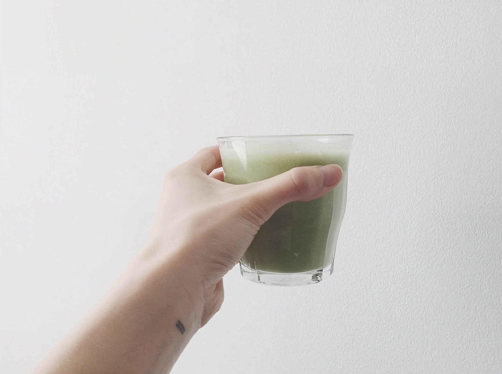
Chi-san had been making her own fresh almond milk at home for a while because she was disillusioned by the quality of almond milk available in the shops. "I used to live above a health food shop and buy almond milk in cartons and just end up thinking there's nothing really 'healthy' about it: there are very few almonds, it's really sweet, it doesn't taste like almonds, and it's gloopy with thickening agents."
Driven by this desire for a nourishing, delicious alternative to non-dairy milks, both as a base ingredient and as a drink, the pair began researching the market, and discovered that no one else was making almond milk in London. "We learned that many of the leading brands making almond milk were only using 1 to 2 per cent almonds per carton, and we couldn't believe that no one else was trying to make it here, so we just knew we had to hurry up and get on with it," says Natali.
"We wanted to do one thing, do it our way, and do it really, really well, but when we started making it we quickly realised why no one else was doing it like that!" says Chi, referring to the gruelling production process involved in hand-making the milk.
Starting at 6am on their production days, they would cold-press the soaked almonds for hours using purified water before transferring the pulp and juice into muslin bags and then squeezing out the white milk by hand. They would then put the milk into chillers – old slush puppy machines – leaving the original just as it was, and adding natural flavours to the rest: cacao sweetened with vanilla and dates; turmeric and cayenne balanced with raw honey; and berries (raspberries and blueberries).
"We were told we would never get it into shops. But within two weeks of selling the bottles Daylesford (the organic farm shop) got in touch via social media and wanted to get a sample." The response to their milks, whose vivid (but wholly natural) colours shine from their chic, minimally branded plastic bottles, has been so overwhelming that Natali and Chi-san pushed themselves to the limit in terms of what they could physically produce themselves, supplying a host of loyal clients who put up with the stop-start supply and brief shelf life.
—Hoxton Mini Press (East London Food)
A creative partnership
During 2014 my work with Chi-San began with building the foundation of the brand's identity as a visual interpretation of the original mission statement. Sincere and simple, in line with The Pressery's genuine guiding principle, its stripped-down style clearly shows that less can indeed be more.
The Pressery was first presented to the public at London's Lower Marsh weekly weekend market in 2014. Sourced from raw Spanish almonds that are activated overnight, then cold-pressed with filtered water in their East London kitchen, the milk came with no preservatives, additives, or artificial sweeteners.
Through 2015 and into 2016 we evolved the brand principles to allow the company's message to focus on increased production and extending the product's shelf life - providing a pathway to national delivery via Tetra and a move from local grocers to national stores.
Logo & Palette
The logo typography is a reworked, balanced version of Sabon LT paired with condensed Trade Gothic LT. Given space to breathe, the logotype always appears adequately padded by a sizeable negative space square; a visual metaphor that nothing is allowed to compromise the absolute simplicity and purity of the product.
The corporate identity features a logomark comprised of two parallel lines; symbolic of the two founders. These lines are used as a visual style asset throughout the stationery and in some special circumstances are presented alone with no other elements.
"UK-based The Pressery stands bravely on retail with its elegant and understated presence. Graphic designer Tim Jarvis was commissioned to create a brand identity that translates the purity of the product in hand meticulously. The serif-clad typography is often used to translate classic and old-timey persona, the opposite of what minimalism stands for with its modern and often geometric embodiment. A simple logo goes a long way, and in this case it is a pleasure to see absolute clarity above all else on this range of products."
—Minimalissimo


Packaging Honesty
One of The Pressery's fundamental motivations was to create a healthy alternative to dairy milk; a product that has suffered from decreasing quality through farming and methods of production. The bottles suggest traditional dairy milk bottles, further confirming that a product of this quality is a perfect replacement for dairy milk that so many people accept as a part of their daily lives.
"The collection of assorted flavours are given plenty of space to shine, the emblematic milk bottle exposes each colour shamelessly; may it be the cacao, berry, turmeric or the classic plain-almond. A wall of anonymous and saturated logos is the worst enemy for brand recognition, clearly The Pressery doesn’t need to worry about that."
—Minimalissimo
"Their dairy and juices are packaged to encourage consumers to go back to the basics. The bottle’s design tributes traditional glass milk bottles with a contemporary restyle using plastic. Because the company’s focus is using clean ingredients, the brand uses a classic black and white palette that is minimally displayed on their packaging."
—The Dieline


The Range
After establishing the core almond milk product and it's production run, Chi and Natali worked through extending the product range into smaller 250ml flavoured drinks to move the range past the fridge at home and on the go.
Sticking to the brand mission, each flavour was carefully constructed and tested in small batches before scaling production. Through this iterative process I built and maintained the label pipeline as the team experimented with different bottle shapes and formats.


Shelf Presence
In 2015 The Pressery fundraised to provide runway to develop a longer-life product line and building out a national grocer pipeline. Moving the product to a six-month shelf life meant a different production process, but also working with Tetra to package and distribute the product - which comes with a fair amount of fresh compliance on terms of product standards and with committing to 16,000 pack production runs. We had to ensure the product and brand would transition through this step change. From this point onwards - local, small batch production that favoured concept, delivering fresh flavours and formats - would evolve to steadier, slower and more entrenched decision-making at the brand and product level.
When looking at shelf visibility, The Pressery was a tiny player against the presence that massive multi-national producers had dominated. At that point there was little to no exposure to artisan or new brands at shelf level, so - with no brand recognition at the national level, the packaging aesthetic had to stop the shopper in their tracks by looking unusual, and interesting.
Through the ideation stage it became clear that the less we put on the carton, the more it became noticeable against mainstream dairy alternatives. By sticking to the brand mission of removing anything unnecessary and distilling the essentials, we'd found focus within a sea of noise.
From this outcome I designed a carton solution that would enable flavours later in the product development cycle - with each carton using a very light pastel secondary colour to denote flavour principle (original, berry, cacao, turmeric, chai) and using white as a shared negative space primary colour under black - with subtle black text and text area background/foreground switching treatments to handle variants within a flavour principle - such sweetened or unsweetened lines.


Executive Summary
The Pressery began in 2014 as a response to a gap on London's shelves: almond milks dominated by cartons containing as little as 1–2% almonds, thickened, sweetened, and a long way from anything genuinely fresh. Working with founders Chi-San Wan and Natali Stajcic from the outset, the brief was to build a brand that matched the honesty of the product itself. The resulting identity stripped everything back to essentials: a modern classic logotype, generous negative space, a two-line logomark for the two founders, and packaging that let the milks themselves do the talking through their natural colour.
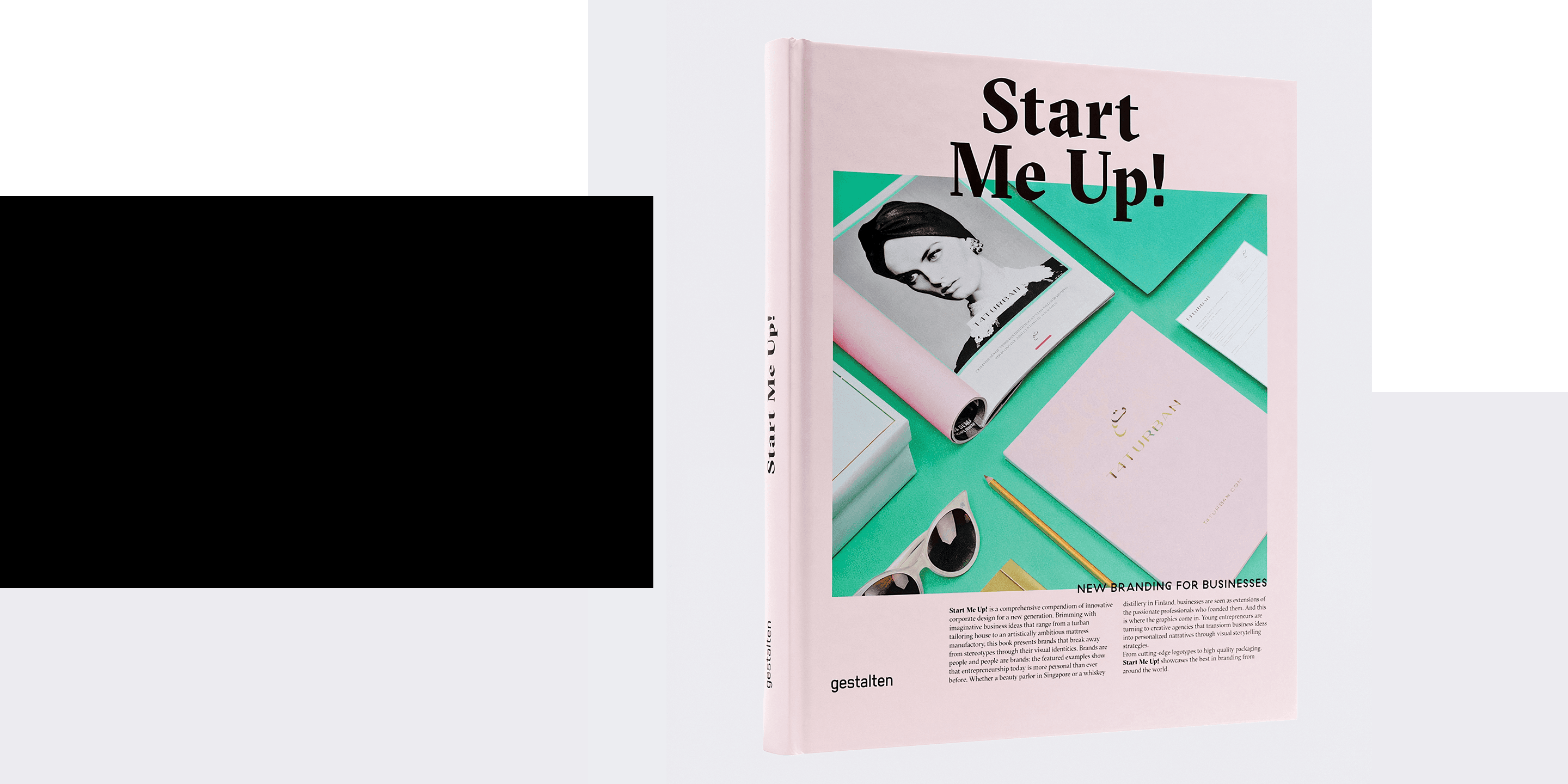
That clarity carried the brand from a Lower Marsh market stall to stockists across London and the natural food ecosystem including Selfridges, Daylesford and The Chiltern Firehouse, and earned coverage in Kinfolk, Monocle, Wallpaper, The Dieline and Gestalten's Start Me Up! By 2015 the company had reached the limits of hand production, and a Crowdcube round was launched to fund a longer-life Tetra line and national distribution.
The campaign hit its £150,000 target in under two hours - the fastest-funding Crowdcube campaign of the year, and closed the day at 150% overfunded across 58 angel investors. Co-founder Natali commented: “We are delighted with the response from Crowdcube members towards our pitch and can’t quite believe we reached our target in under two hours.”
Scaling into Tetra meant new compliance, 16,000-unit production runs and a step change in how brand decisions were made. The packaging system was rebuilt around a shared white field with pastel accents to code flavour principle and subtle foreground/background switches for variants within each line, holding the original mission intact while giving The Pressery the shelf presence to stand against multinational dairy alternatives. Across three years the work moved from a single hand-pressed product to a recognisable national range, and helped set a visual register that much of the wider plant-based category has since adopted.


